Insights - Interview Load Balance
Last updated: March 18, 2026

Interview Load Balance: This article provides an overview of the 'Interview Load Balance' report within GoodTime's Insights Tab
TL;DR: GoodTime has introduced a new Load Balance Report featuring an interactive bell curve graph. It helps you visualize how interview load is distributed across your interviewers, identify outliers, and dive into contextual factors like calendar availability and decline rates. This makes it easier than ever to ensure interview load is balanced and fair.
Interview Load Balance 101:
- The 'Interview Load Balance' report is designed to provide a week-over-week view of how many interviews each of your interviewers are hosting.
- The report is designed as a 'heat map' to allow you to quickly identify (via the darker colors) which interviewers are conducting the most interviews.
- Hovering over each weekly 'tile' within the heat map provides additional information about the specific interviewers scheduled interviewers including their decline rate and if they were scheduled manually (selected by name via a coordinator), or automatically by GoodTime (via a template or tag group).
- The report also allows to you apply filters to this data including summarizing the report by interviewers with high decline rates.
🎥 The following video provides an overview of the GoodTime Load Balance Report:
How to Navigate to Load Balance Report
Navigate to GoodTime.
Click on the Insights menu in the top right corner.
Select the Load Balance Report from the dropdown.
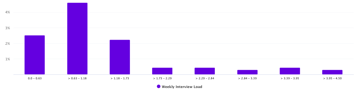
📈 What the Bell Curve Tells You:
The visual centerpiece of the report is a bell curve, which shows the distribution of average interviews per week:
Left side: Interviewers doing very few interviews (e.g., 0–0.4/week).
Middle: The ideal cluster—your target average (e.g., 1–2/week).
Right side: High performers doing the most interviews.
This visual helps you spot imbalances at a glance.
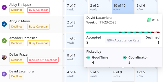
👤 See Who’s Behind the Numbers:
Click on any bar in the graph to view the specific interviewers in that group:
See how many interviews each person has done.
Learn if they were chosen via GoodTime’s algorithm or manually by a coordinator.
Hover over their name for quick stats like:
Total interviews
Accepted/declined rates
How they were selected (algorithm vs. manual)
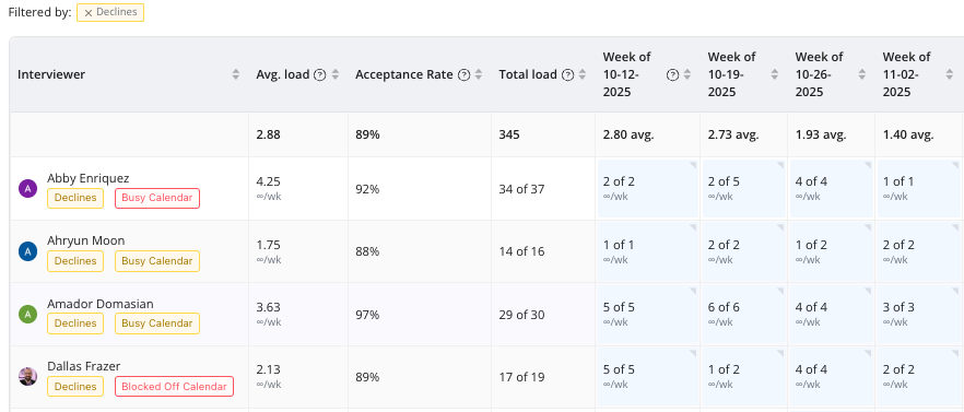
🏷 Understand Interviewer Context:
Each interviewer may have contextual labels to help explain their load:
Busy Calendar
High Decline Rate
Blocked Off Calendar
You can click these labels to filter interviewers and explore deeper:
For example, if someone has a low load but a Busy Calendar, it’s likely they simply weren’t available when interviews were being scheduled.
Hovering over a person shows their availability week by week (e.g., Emily was only 64% free during the week of June 29).
This helps you decide whether the imbalance is due to system error or just real-world availability.
💡 Final Takeaway
This updated report brings transparency and control to interviewer scheduling. With just a few clicks, you can:
Diagnose load balance issues.
Identify top contributors and underutilized team members.
Adjust based on real constraints like calendar availability.
Ultimately, it helps ensure fairness and efficiency across your interview process.